|
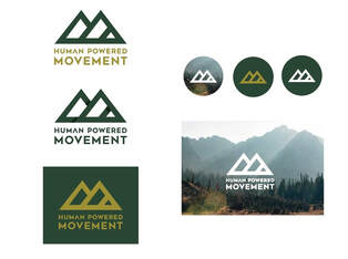
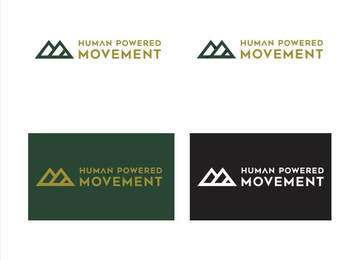
Bold. Minimal. Direct. These are three foundational words used to launch the creative process of the eventual Human Powered Movement logo. Happily, I am both a right and left brained person. I enjoy pouring over spreadsheets and digesting data to let numbers drive decisions (I track most of the Human Powered Movement challenges manually by the way). In other cases, I throw data out the window and let my gut feeling take the steering wheel. This is how I approached the HPM logo. I’m sure there is scientific research that could determine if this is a good logo or not … current color scheme trends, the most aesthetically pleasing linework, perfectly balanced proportions, etc. I’m not focused on that; I’m focused on how I subjectively view this logo. How the right side of my brain responds. I likely analyze and scrutinize the logo way more than others. At the end of the day, everyone will view from their own lens. This is the beauty of humankind. We each have our unique perspectives, opinions, and triggers that make us tick. For me, I see a lot in this logo.
Bold. Minimal. Direct. View it however you’d like. Keep it simple or dig deep. Whichever side of your brain perks up, know that there is intention housed within the logo. The end goal for the Human Powered Movement experience is to be a positive one. Logo included. Journal - Inside the Human Powered Movement LogoCategories All Comments are closed.
|
Human Powered JournalWritings and musings of an active lifestyle
Author
Adam Bratton is the Founder and Head Enabler at Human Powered Movement. Guest Contributors are more compelling in written word and life in general. Categories
All
|


